As a follow up to our webinar on date dimensions, I thought I would quickly rehash adding a Power Query date dimension. Additionally, I’ve included two use cases that we did not have time for in the webinar: Inactive date relationships and custom date hierarchies in visuals.
The webinar video shows how to create a Power Query date dimension table and add it to your data model. You can see the breakdown of the individual steps in the video, but to summarize:
- Copy / Paste Power Query code into blank query in Power Query to create date function.
- Invoke date function to create date dimension.
- Apply your changes to add the table to your model.
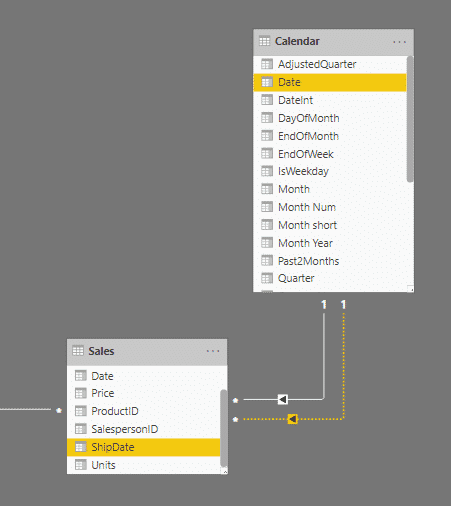
- Connect the new date dimension to your existing tables.
In the webinar, I connected my Calendar table to my Sale stable twice. The second was an inactive relationship between Calendar[Date] and Sales[ShipDate].
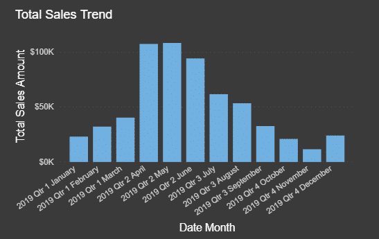
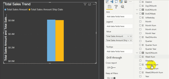
For our first use case, let’s see how to use that inactive relationship using USERELATIONSHIP(). Here, I have a simple column chart with 2019 sales. This is using the original relationship I made in the video: Calendar[Date] to Sales[Date]. Let’s say I want to see revenue over months, but the invoice isn’t paid until a product ships.
To use the ship date relationship, I need to create a measure referencing the inactive relationship:
USERELATIONSHIP() should include the two columns in the inactive relationship; the order does not matter. I just wrap this in a CALCULATE function that includes my original sales measure. Added to the visual, we now have this:
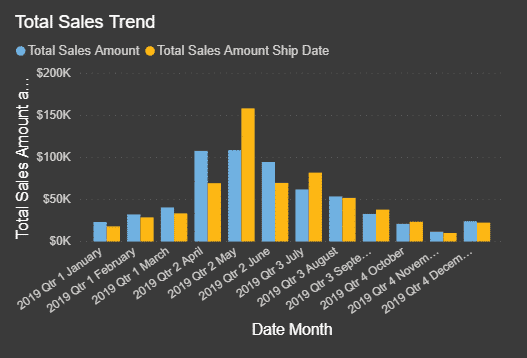
We now see the sales amounts differ when using the ship date, likely due to sales closer to the end of the month that do not ship until the following month. The new measure uses the inactive relationship to return the data.
For our second use case, we want to customize our X axis to use shorter, date descriptions but not lose the ability to drill up / down. A common misconception is that you must create an ‘official’ hierarchy that look similar to the default date by dragging a field under another field like this:
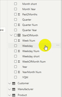
This is a great feature, but it is more for convenience than a requirement for drilling to work. If you create a hierarchy this way, you can easily add it to other visuals, but it is not necessary; Power BI is ‘smart’ enough to use any fields as a hierarchy as long as the data model supports it.
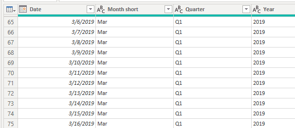
In this example, we want to use Year, Quarter, Month short to create a shorter label, e.g. 2019 Q1 Mar. I can just add these fields to the visual (in that order) and the drill features will work as intended.
Why does this work without me having to do anything special? It is because the hierarchy naturally exists in the table. That is, every row in a date table is a date. Every date in March 2019 shares the same values for the columns Year, Quarter, Month short, or 2019, Q1, Mar.
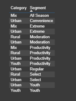
This ‘natural hierarchy’ can work in any table. Be aware however that Power BI assumes you have checked your data, so if you have a product segment belonging to multiple product categories by mistake, Power BI will just assume that is intended. An example is shown below. Although intended for this data, this could be a problem with your data if product segments should not be a part of multiple product categories.
Stay tuned for future date table blog posts!
Eager to learn more? Book our Microsoft Certified Trainers to teach your organization data modeling for Power BI. Our team is here to help you unlock key insights from your data. Check out our Business Intelligence services here to learn more.
IronEdge Group Recognized on CRN’s 2024 MSP 500 List

Houston, Texas, February 12, 2024 — IronEdge Group is honored…